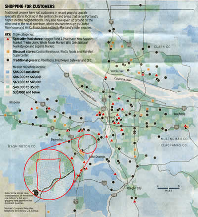
Take a close look at the circles on this map from the front page of the Oregonian‘s business page on Sunday. The graphic accompanied a story on grocery shopping patterns, how the industry is changing, and the background colors are supposed to indicate changes in the median household income in the metro area.
But for some reason — most likely in the interests of creating a stylistically “cool” graphic — the designers (credited as Derrik Quenzer and Lynne Palombo of the Oregonian) chose colors with virtually no contrast to represent three of the five income ranges.
The darkest blue and green are easy to pick out. The mid-range green used for the “$35,000 and under” category is fairly obvious in most contexts, but the two shades of light blue are almost indistinguishable, particularly on newsprint.
Within the circle, there’s actually a section of mid-range blue (“$86,000 to $63,001”) surrounded by light blue (“$63,000 to $48,001”). In the detail blowup, I’ve surrounded the the mid-range area with a red line just outside its boundary. It’s still almost indistinguishable.
This kind of style over substance negates the basic purpose of a news graphic. The blue/green look may have been intended to give a Portland “feel” to the map, but limiting the palette to those colors makes it virtually useless.
And what was the intent behind reversing the income ranges: $63,000 to $48,001? Who does that?